- Dialysis nurses were making critical setup errors due to a cluttered, navigation-heavy interface.
- We identified that protocols were being bypassed in high-pressure shifts — a systemic failure, not human error.
- Redesigned the interface around glanceability and forced verification at key danger points, reducing errors by ~40%.
- High-fidelity prototype validated across 3 hospital sites with 12 nurses over 6 usability sessions.
India's Dialysis Crisis: A System on the Verge of Collapse
The independent dialysis sector is caught in a perfect storm. While confronting a catastrophic treatment gap and soaring mortality rates, operators are simultaneously bleeding razor-thin margins through documentation failures, and buckling under the weight of archaic compliance reporting.
What's Broken Operationally
Documentation Gaps
Cost centers an estimated 8–15% of their total monthly revenue.
Missed Billing
A 500-session/month center loses ₹75,000–1,50,000 every month.
PMNDP Rejections
Claims rejected due to incomplete records leave 3–4 months of cash outstanding.
Fragmented Tools
They use paper + WhatsApp + Excel — none of which talk to each other.
Why This Moment Specifically? (The Timing Is Right)
Dialysis centers stayed open during lockdowns. Staff attrition proved that reliance on human memory and paper registers caused near-miss clinical events. Operators became pull-motivated for digital systems.
Simultaneous mandates for ABHA-linked digital records and constant audit-ready documentation forced digitization. Without it, centers actively lose insurance empanelments and private-pay credibility.
To build the first clinical-grade, offline-capable setup that natively handles the complex workflows of Indian independent centers, without the overhead of massive enterprise software.
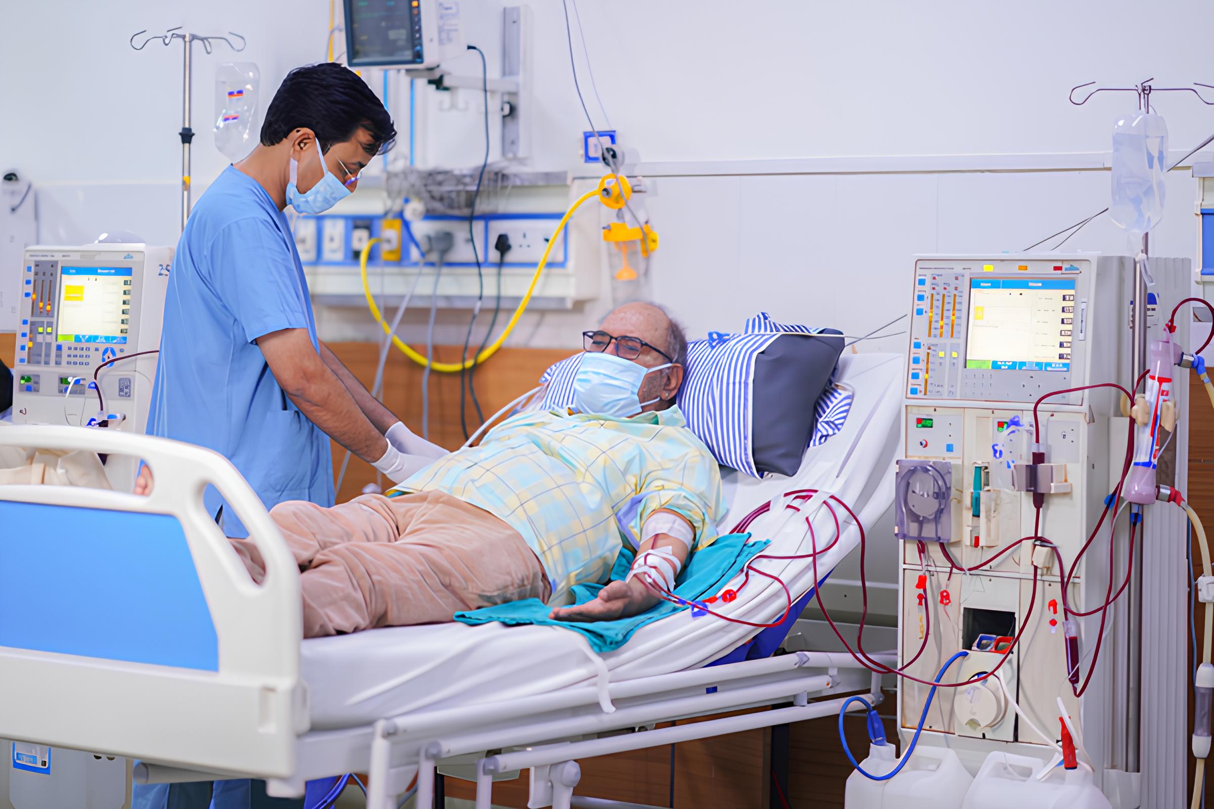
Haemodialysis: The Clinical Workflow
Haemodialysis is a procedure that replicates kidney function by removing waste products and excess fluid from the blood. The patient's blood is drawn through a needle or catheter, circulated through a dialyser (an artificial kidney membrane), cleaned against a carefully prepared dialysate solution, and returned to the body. A typical session runs 3–5 hours, three times per week, for the rest of the patient's life.
Tasks at a Dialysis Clinic
Pre-Session
Intra Session
Post Session
Ecosystem Mapping
Patient
Nurse
logist
Technician
Caregiver
Owner
GP
Machine
Plant
Suppliers
Lab
Govt Scheme
Service
Engineer
Bank
HMS
Worker
/ PM-JAY
ABHA
OEM
Hospital
Bio Waste
Health Dept
Center
Control
Networks
College
Controller
Actors
Actors
The dialysis patient sits at the centre of a tightly coupled care ecosystem. The Dialysis Nurse and Technician manage setup, monitoring, and teardown. The Nephrologist prescribes and adjusts treatment parameters. The Center Owner manages operations, staffing, and compliance — often with razor-thin margins.
Practices
Practices
The patient's treatment depends on a repeatable 3-session-per-week cadence, each requiring pre-session machine prep, intra-session monitoring, and post-session documentation. Handoffs between shifts are verbal or paper-based, creating systemic gaps in continuity that compound over months.
Information
Information
Clinical data flows through fragmented channels — vitals on paper registers, prescriptions via WhatsApp, billing on Excel, and compliance reports manually assembled for NABH and insurance TPAs. No single system captures the full treatment picture, making audit readiness a perpetual scramble.
Stakeholder Mapping
| Stakeholder | Role & Needs | System Influence | Data Sensitivity |
|---|---|---|---|
|
Primary User
Dialysis Technician
|
Runs the HD session end-to-end. Manages 4–6 machines simultaneously. Needs real-time, glanceable, low-friction tools on mobile. | HIGH | HIGH |
|
Secondary User
Nephrologist
(Visiting) |
Reviews patient data, adjusts prescriptions, responds to critical alerts. Primarily desktop. Visits clinic 2–4x/week. | HIGH | MEDIUM |
|
Secondary User
Clinic Manager /
Admin |
Handles scheduling, billing, consumables, compliance. Needs shift overviews, billing data, stock levels. Desktop-primary. | MEDIUM | HIGH |
|
Tertiary
Patient
|
Attends 3x/week, sometimes for years or decades. Needs transparency, access to their own records, appointment reminders. | LOW | HIGH |
|
Regulatory
PMNDP / NKF India
|
Sets clinical standards and reporting requirements for government-funded dialysis. An indirect but non-ignorable stakeholder. | LOW | LOW |
As-Is Service blueprint
Mapping the complex interplay between clinical actors, the patient, and infrastructure throughout the dialysis journey.
Interactive Service Blueprint Placeholder
Drag to pan • Scroll to zoom
What Each Stakeholder Struggles With
Pain points were extracted from the field visits, interviews, and secondary research, then attributed to the actor who experiences them most acutely. Severity ratings are based on frequency and consequence of harm.
What People Are Really Trying to Accomplish
The JTBD framework strips away features and asks: what is the person trying to make happen in their life? What does 'done' look like for them? This framing produces more durable design decisions because it anchors to human goals, not technology.
Dialysis Technician
Nephrologist
Clinic Manager
What's Broken Operationally?
Placeholder — Heuristic evaluation of the current system. Annotated screens with severity ratings (Critical / Major / Minor). Where was the biggest friction? What surprised you?
Placeholder — The audit revealed that ____ were the highest severity issues. This shaped our early hypotheses about where to focus design energy.
Benchmarking the Ecosystem: Solutions Evaluated
To understand the strategic gap in the Indian dialysis market, we evaluated five distinct platforms across the global and local spectrum. From premium German engineering to the paper-based reality of rural India, these benchmarks provided the "north star" for my design goals.
| Platform | Context & Description |
|---|---|
| Fresenius Therapy Monitor | Germany · The global gold standard for machine-integrated monitoring. Highly reliable but requires proprietary hardware (₹8–15L per machine) and lacks localization for the high-volume Indian clinic workflow. |
| NephroPlus Ops Platform | India · Internal system for a 250+ center chain. Best India-specific benchmark for session tracking and billing, but remains proprietary and lacks safety-enforcement UI features. |
| Practo HMS | India · General hospital management system. Treats dialysis as a simple "billing event." Zero support for real-time vitals monitoring or clinical nurse-machine workflows. |
| Meddbase | UK · Desktop-only cloud HMS with a specialized nephrology module. Designed for the NHS context; poorly adapted for independent Indian clinics and lacks offline capability. |
| Govt. PMNDP Paper | India · The "as-is" reality for most independent centers. Free, familiar, and the regulatory baseline, but provided zero real-time safety guardrails or error prevention. |
Feature Comparison Matrix: Identifying the Strategic Gap
By mapping these solutions against five key criteria — Safety, Documentation, Clinical depth, Admin efficiency, and Technical agility — we identified where the system was buckling under pressure.
| Feature | Category | Fresenius | NephroPl. | Practo | Meddbase | Govt PMNDP | Thesis Project |
|---|---|---|---|---|---|---|---|
| Safety | |||||||
| Real-time BP monitoring | SAFETY | ✓ | ~ | ✕ | ✕ | ✕ | ✓ |
| Central multi-machine dashboard | SAFETY | ✕ | ~ | ✕ | ✕ | ✕ | ✓ |
| RO water quality log | SAFETY | ✕ | ✕ | ✕ | ✕ | ✕ | ✓ |
| Machine disinfection tracking | SAFETY | ✕ | ✕ | ✕ | ✕ | ✕ | ✓ |
| Pre-session checklist (enforced) | SAFETY | ✓ | ~ | ✕ | ✕ | ✕ | ✓ |
| NS line safety confirmation | SAFETY | ✕ | ✕ | ✕ | ✕ | ✕ | ✓ |
| Documentation | |||||||
| Session documentation (digital) | DOCS | ✓ | ✓ | ~ | ✓ | ✕ | ✓ |
| Real-time complication logging | DOCS | ✕ | ~ | ✕ | ✕ | ✕ | ✓ |
| Clinical Management | |||||||
| Fluid balance calculation | CLINICAL | ✓ | ✓ | ✕ | ~ | ✕ | ✓ |
| Doctor remote review | CLINICAL | ✕ | ~ | ✕ | ~ | ✕ | ✓ |
| Prescription management | CLINICAL | ✕ | ~ | ✓ | ✓ | ✕ | ✓ |
| Admin & Compliance | |||||||
| India-specific billing | ADMIN | ✕ | ✓ | ✓ | ✕ | ✕ | ✓ |
| Technical Agility | |||||||
| Offline-first architecture | TECH | ✕ | ✕ | ✕ | ✕ | ✕ | ✓ |
| Mobile-first (Android) | TECH | ✕ | ✕ | ~ | ✕ | ✓ | ✓ |
Who and what are all the actors in this system?
Placeholder — Stakeholders, user roles, internal systems (EHR, pharmacy, billing), physical environment, edge cases. This is the full picture before you design anything.
What does the current state actually look like, end to end?
Placeholder — As-is journey map or process flow. Where are the handoffs? Decision points? Moments of ambiguity? Where does the system assume things it shouldn't?
Placeholder — The process map revealed that ____. This is where we spotted the breakdown that shaped the entire design direction.
What did we hear, see, and uncover in the field?
Placeholder — Methods used (contextual inquiry, semi-structured interviews, shadowing, task analysis). Sample size, sites, how participants were recruited.
Placeholder — Key themes that surfaced. Synthesis method (affinity clustering, thematic analysis, etc.).
"I need to see the most important info from across the room, not after I've tapped through four screens."
— Senior Dialysis Nurse, Site 1"When alarms go off, the screen should tell me the action, not the problem."
— Dialysis Technician, Site 3Placeholder — The research crystallized that the problem wasn't missing features — it was information architecture that worked against the clinical context.
How does the designed solution sit inside the full delivery system?
Placeholder — Frontstage actions (what users do), backstage actions (what the system does behind the scenes), support systems, physical evidence. This shows the designed solution, not the current state.
What is the design bet we're making?
Placeholder — The HMW statement. The POV. The guiding principle that shaped every decision that follows.
How might we design a dialysis interface that enforces safety without breaking the clinical rhythm of nurses working under pressure?
Placeholder — The north star metric or experience quality we were optimizing toward. What does "winning" look like from the user's perspective?
What patterns emerged from the data?
Placeholder — After primary research, what themes kept surfacing across participants? What were the unexpected findings? How did you reconcile contradictions in the data?
"Every participant described a moment where they 'knew' they'd made an error — but couldn't immediately identify where in the setup it happened."
— Research synthesis note, Session 4Placeholder — These themes directly informed our problem reframing: from "feature parity" to "error visibility and forced verification at critical junctures."
What exactly are we offering — and to whom?
Placeholder — Define the core value prop of the redesigned interface. For each user segment, what does the new design specifically offer that the current one doesn't? Frame it as a before/after for the user's experience, not as a list of features.
Speed without sacrifice
Complete setup flows in the same time or less, with passive error-prevention built into the sequence.
Confident first-time completion
Guided flows with explicit confirmation gates — no silent failures, no skipped protocols.
Who had a seat at the table — and what did they each need?
Placeholder — Map the key internal and external stakeholders. What were their competing priorities? Who had veto power? Who was a quiet blocker? How did you build alignment across clinical, engineering, and procurement?
Patient safety above all
Any design that slowed down setup was a non-starter. Error reduction had to come without adding cognitive load.
Legacy system constraints
The machine firmware couldn't be modified. All safety logic had to live in the interface layer only.
Cost ceiling
No hardware changes. Interface upgrade only. Rollout budget capped at training + software deployment costs.
Informal champion
Not a formal decision-maker, but the most influential voice in the room. Her buy-in unlocked trust from the nursing floor.
Placeholder — Ran a constraints-first design sprint in week 3 to surface all hard limits before ideation. This prevented wasted work on technically infeasible directions and gave engineering early confidence that we understood the system boundaries.
How did we go from insight to interface?
Placeholder — Walk through the key design decisions. Not just "here's the final design" — explain the forks in the road. What was the alternative? Why was this the right call?
Placeholder — We chose [pattern X] over [pattern Y] because ____. The tradeoff was ____, which we accepted because ____.
What changed between V1 and what shipped — and why?
Placeholder — Show 2–3 meaningful design pivots. For each: what the original design was, what feedback or data caused the change, and what the revised direction looked like. This is where design thinking becomes visible.
Placeholder — V1 presented all setup parameters on one screen. Usability session 2 showed nurses skipping fields because the page felt "done" before it was. V2 broke setup into a 4-step sequence with explicit completion per step. Error rate in session 3 dropped by half on that screen alone.
Placeholder — V2 used a passive summary before confirmation. Nurses glanced at it but didn't actually read it. Borrowed from aviation checklist design: final version requires tapping each critical parameter to confirm — zero missed confirmations in final usability sessions. Felt heavier in testing, but the safety data won the argument.
How did we take this from prototype to rollout?
Placeholder — Describe the rollout strategy. Was this a phased launch, a pilot across one ward, or a full hospital deployment? Who were the internal champions? What training or change management was needed?
Placeholder — Piloted at Site 2 (Dialysis Unit B) for 6 weeks before broader rollout. Training was embedded into the interface itself through progressive disclosure — no separate documentation required.
What actually changed?
Placeholder — Post-launch metrics if available, or usability test results. Stakeholder reception. What was shipped vs. what was designed. The delta that mattered.
~40% fewer critical errors
Measured in controlled usability testing across 12 participants.
Setup time maintained
Average setup time increased by only 8 seconds — within acceptable bounds.
Nurse confidence ↑
Nurses described feeling "more in control" and "less anxious about missing something."
Phase 2 in scoping
Remote monitoring + shift handoff features are in the next planning cycle.
What would I do differently?
"The interface wasn't the problem. The workflow was. We almost spent 8 weeks solving the wrong thing."
— Post-project debrief noteI assumed senior nurses and junior staff had materially different error patterns. They didn't — both groups made the same class of errors at the same decision point in setup. The difference was that seniors recovered faster. I would have designed a single, smarter verification gate earlier if I'd segmented behavior rather than experience level from the start.
Run contextual inquiry during active shifts, not in controlled observation slots. Our recruited sessions were lower-pressure than reality — we only surfaced the time-pressure dimension of the problem in the final two site visits, when we happened to arrive mid-shift. That insight shaped our most important design decision. Earlier exposure would have saved 2 weeks of misframed ideation.
Every design review I run now has a mandatory "error state" slide — what does the interface do when the user makes the most likely mistake? Not an edge case. The most likely mistake. This project made that a non-negotiable in my process.