AIIMS Jodhpur loses 11.5 hours daily due to system friction. How do we overcome this?
- Conducted a 120+ hour clinical immersion at AIIMS Jodhpur to analyze the Hospital Management System in active practice.
- Designed a structured audit plan and scoring system across 16 parameters to evaluate 400+ distinct friction points.
- Developed a framework to prioritize design adoption based on the clinical criticality of each hospital segment.
- Architected a multi-phase roadmap to guide future system deployments and development by CDAC.
A National Apex Center Serving Millions
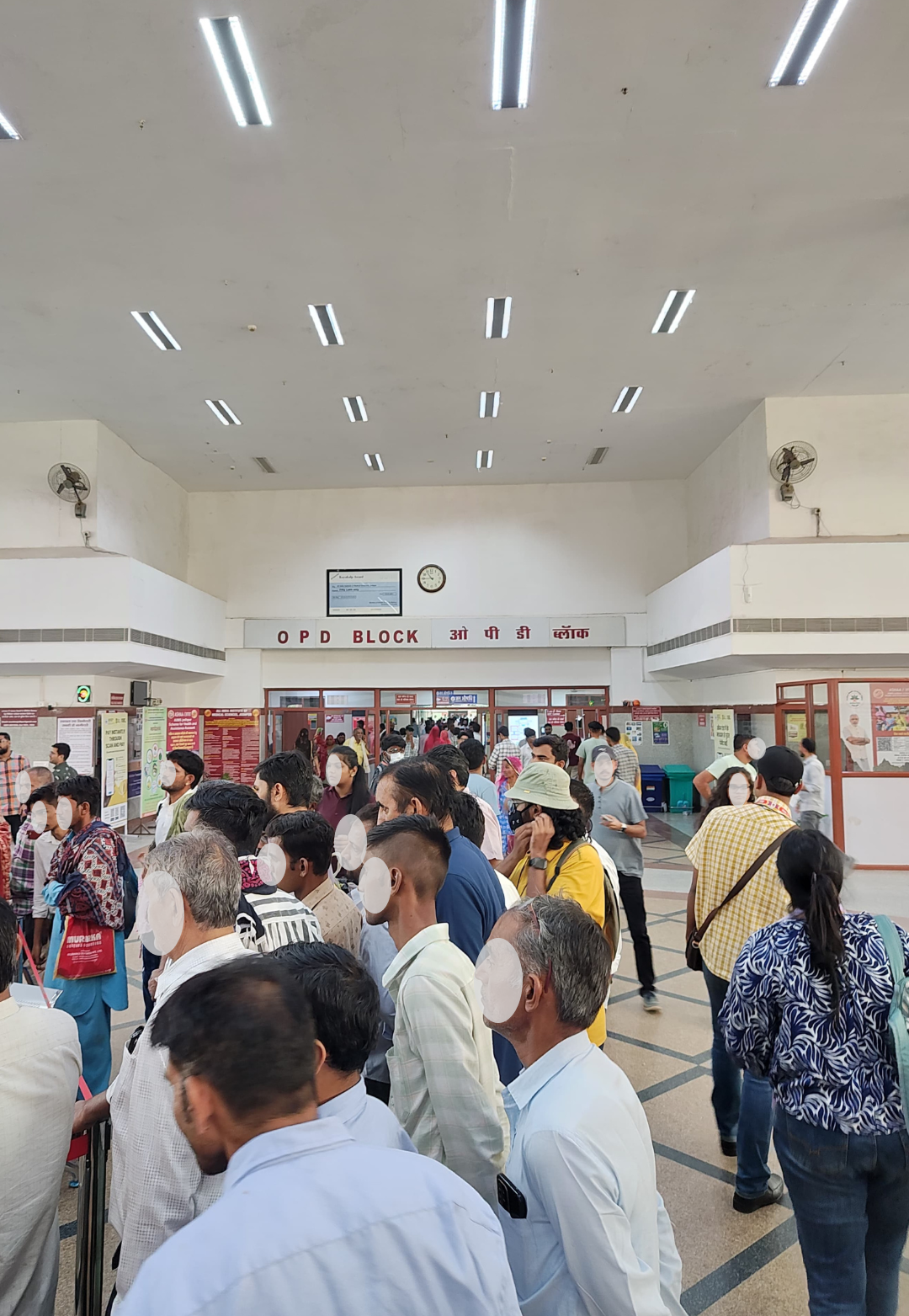
As one of India’s premier Institutes of National Importance, AIIMS Jodhpur is an indispensable lifeline for Rajasthan, handling over 4,000 outpatients every single day. The institution is a marvel of healthcare scale—digital kiosks, medical passbooks, and public-facing apps signal a world-class HMS infrastructure. Yet, inside the wards and desks, a different reality was visible.
I investigated the system. Here's how I did it — and what I eventually found.
Understanding Tertiary Hospital Infrastructure
The Magnitude of AIIMS Operations
As a Tertiary Super-specialty Institute of National Importance, AIIMS Jodhpur handles immense clinical data velocity. This HMS operates as a critical node in the national ABDM framework, mandating strict adherence to the DPDP Act 2023 and HIPAA-grade security standards to protect millions of patient records.
Clinical Scale
Tertiary classification handling 4,000+ daily OPD capacity
Ecosystem Breadth
14 interconnected clinical modules across diverse departments
AIIMS Jodhpur
HMS
Interoperability
Mandatory integration with the national ABDM & ABHA framework
Data Governance
Compliance with DPDP Act 2023 & global HIPAA benchmarks
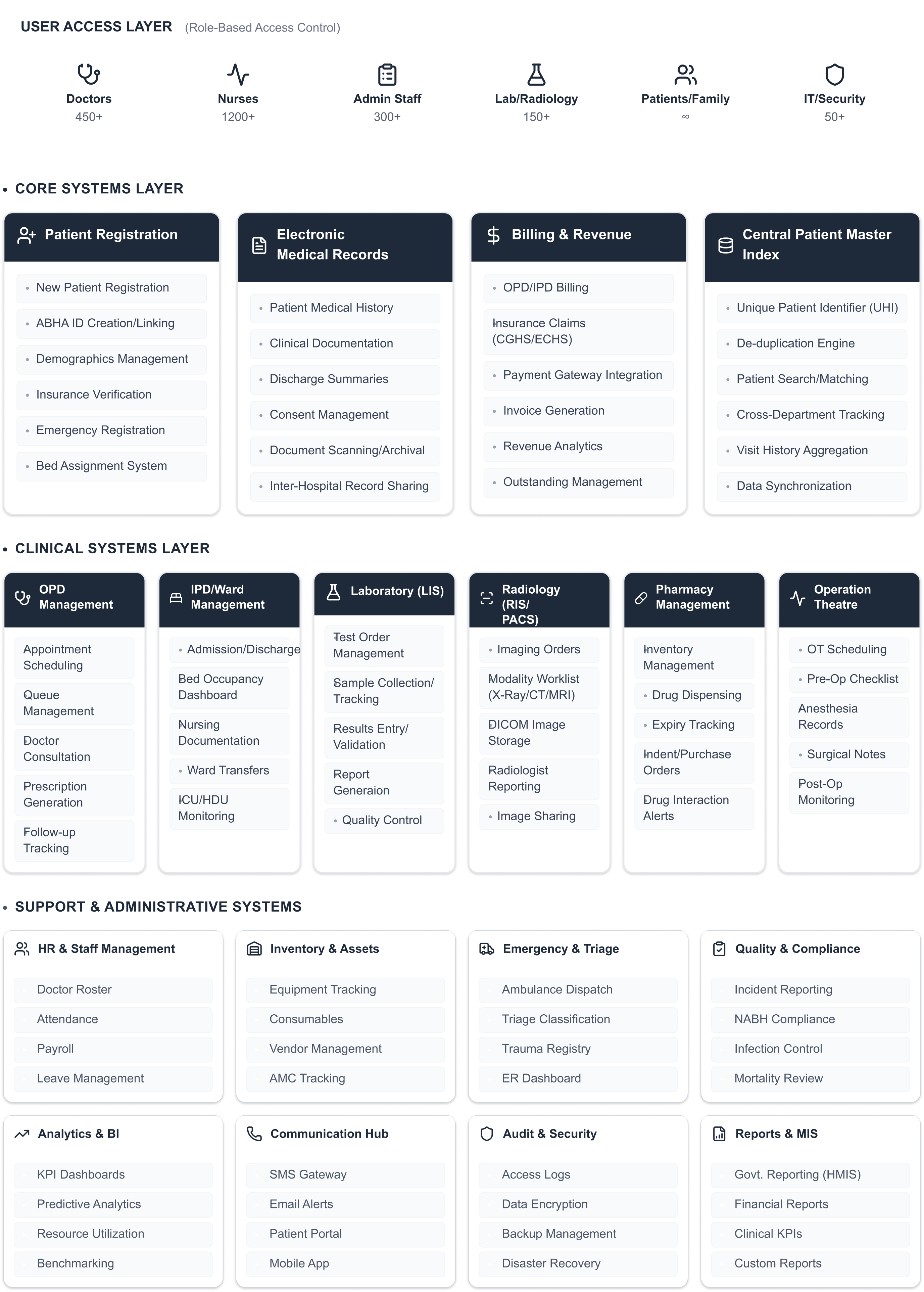
The 16-Column Audit: Turning Chaos into a Database
A standard heuristic evaluation is insufficient for a clinical environment as complex as AIIMS. To move the needle with CDAC engineers and hospital leadership, I designed a 16-column audit instrument that treated every interaction as a data point. I didn't just look for "friction"; I tracked Clinical Risk, Workaround Types, and Technical Latency.
Note: The audit database below is a focused glimpse into 25 high-stakes insights from the In-Patient Department (IPD). The master audit encompasses 400+ data points across 14 clinical modules.
The Clinical Edge: Stress-Testing the IPD Desk
Analyzing the IPD Doctor Desk revealed that UI failures weren't just "annoying"—they were blocking clinical workflows. Large grids with missing data, invisible navigation tabs, and fractured patient dashboards were creating a compounded burden on physicians.
Tracking Workaround Types like 'WhatsApp', 'Memory', and 'Personal Phone' was a turning point. It allowed me to show the administration that the bad UX wasn't just slow—it was forcing clinicians to move hospital data out of secure systems.
The 5 Systemic Failure Clusters
Through 400+ hours of clinical immersion, I identified that the friction wasn't random—it was systemic. These issues repeated across 14 modules, creating a compounded burden on clinicians. By categorizing these into five Failure Clusters, I provided the leadership with a strategic lens to view the ecosystem's instability.
Notification
Blindness
Cluster 1
Critical results fail to trigger system-level notifications, forcing clinicians to rely on WhatsApp.
Persistence
Failure
Cluster 2
In the ICU, hourly vital logs often fail to persist (save) due to backend timeouts.
Process
Bypass
Cluster 3
Rigid 'Mandatory Field' requirements force clinicians to enter dummy data to proceed.
Performance
Debt
Cluster 4
Safety checks take 10+ seconds to load, forcing JRs to bypass the system.
Cognitive
Burden
Cluster 5
Extreme manual overhead in Radiology where automated tools fail.

The Roadmap: Impact vs. Interoperability
Presenting 400+ friction points to the engineering teams at CDAC (Centre for Development of Advanced Computing) could have easily overwhelmed their sprint cycles. Rather than handing over a massive backlog of UX complaints, I synthesized the audit findings into a strictly phased roadmap. Every recommendation was evaluated against a custom 3-axis prioritization framework: Clinical Severity (does this failure risk patient safety?), Technical Feasibility (how much legacy code refactoring is required?), and Process Impact (will fixing this eliminate shadow workflows?). This transformed an abstract user experience problem into a highly structured, executable engineering timeline.
Key Recommendations to CDAC
- Smart Registration: Reducing the 52-field form to a 6-field Emergency Triage flow.
- Inter-departmental Sync: Real-time FHIR triggers between Billing and Radiology.
- Alert Orchestration: Moving from modals to a non-blocking sidebar notification system.
Designing for Systems, Not Just Screens.
"The interface wasn't the problem. The institutional logic was. We almost spent 8 weeks solving the wrong thing."
— Personal Project ReflectionI learned that the most important users aren't just the doctors—they are the billing clerks and data entry operators who hold the clinical chain together. If they fail, the doctor never gets the data they need.
[Writing Prompt: Summarize what you learned about being a 'Staff UX Researcher/Strategist' in a massive public health project. What's your takeaway about resilience in software?]